Introduction
Bar chart races have become very popular in recent times, to the point where they have been part of several viral visualisations. Bar chart races are great because they attract a crowd and it’s fun to see graphs that move.
As such, I thought I would set out to create my own bar chart race and publish it on the internet. Why? Well, I want those sweet worthless internet points, but also I wanted an excuse to learn to use an interesting package in R called gganimate. gganimate is a wrapper around the famous ggplot which you can use to make your static ggplots come to life!
The following is a sort of walk through of how I created my bar chart race, right from getting and wrangling the data through to building the animation. Hopefully you can use some of the steps I present to create your own bar chart race (or even modify this one).
Of course, I will be using AFL data for this. What we will visualise is how each team’s ELO ratings evolve through time (you can find an explanation of ELO ratings here). This is a good thing to visualise using bar chart races because we know that different teams will dominate different eras of football, so the bars will naturally change order as time progresses.
Now, we need to do two things: 1. Get a dataframe of ELO rating for each team for a given Round - Season. 2. Use this dataframe to create the animiation using gganimate
Step 1: Calculating ELO ratings
We will do the whole exercise in the R programming language and start from the beginning by calculating the ELO ratings before hand using historical match data.
Getting the data
First, lets install some important libraries. These include the famous fitzRoy package () that will give us access to previous results, and the elo package, that will calculate the elo ratings for us.
extrafont::loadfonts(device = "win")
library(dplyr)
library(elo)
library(lubridate)
library(fitzRoy)
library(tidyr)
library(MLmetrics)
library(ggplot2)
library(colorRamps)
library(gganimate)
library(pracma)
Now lets download the match results using fitzRoy. The results will be a dataframe with all match results dating back from 1897.
results <- fitzRoy::get_match_results()
# results<-readRDS(paste0(cDir,'/results.rds'))

# Mutate a First Game Flag and a Season Round ID
results <- results %>% mutate(seas_rnd = paste0(Season, ".", Round.Number),
    First.Game = ifelse(Round.Number == 1, TRUE, FALSE))

# Output the top sample
results %>% head()
## # A tibble: 6 x 18
## Game Date Round Home.Team Home.Goals Home.Behinds Home.Points
## <dbl> <date> <chr> <chr> <int> <int> <int>
## 1 1 1897-05-08 R1 Fitzroy 6 13 49
## 2 2 1897-05-08 R1 Collingw~ 5 11 41
## 3 3 1897-05-08 R1 Geelong 3 6 24
## 4 4 1897-05-08 R1 Sydney 3 9 27
## 5 5 1897-05-15 R2 Sydney 6 4 40
## 6 6 1897-05-15 R2 Essendon 4 6 30
## # ... with 11 more variables: Away.Team <chr>, Away.Goals <int>,
## # Away.Behinds <int>, Away.Points <int>, Venue <chr>, Margin <int>,
## # Season <dbl>, Round.Type <chr>, Round.Number <int>, seas_rnd <chr>,
## # First.Game <lgl>Optimizing the ELO hyper - parameters
The ELO ratings are essentially built by fitting a model to your results data. You can read more about it here. This model depends on a number of hyper-parameters that need to be optimized to maximise how good the model is. There are four important hyper-parameters in the model: Home Ground Advantage (HGA), carryOver, k_val and max_marg. Again, I won’t spend too much time explaining what these are, but you need to choose some combination of these parameters before you create your ELO model. In order to choose the best combination, we will create a grid of potential combinations, build an ELO model for each of these combinations and measure the success of the ELO model on the historical results. We will then choose the best combination of hyper-parameters that leads to the highest accuracy and lowest Log-Loss (a measure of how good your model’s confidence is).
# Set hyper parameters
HGA <- seq(0, 30, 2)  # home ground advantage
carryOver <- seq(0.1, 0.9, 0.01)  # season carry over
k_val <- seq(0, 50, 2)  # update weighting factor
max_marg = seq(50, 100, 10)  # max margin
initial_value = 1500

# Create a grid of hyper parameters using the expand.grid function
hyper_parameters = expand.grid(HGA, carryOver, k_val, max_marg, initial_value) %>%
    rename(HGA = Var1, carryOver = Var2, k_val = Var3, max_marg = Var4, initial_value = Var5)

# Choose a random subset of it, 10000 rows long
Ntests <- 3000
hyper_parameters <- hyper_parameters[sample(1:nrow(hyper_parameters), Ntests),
    ]

# Create a data frame to capture the results of each combination
optimization_result <- hyper_parameters
optimization_result$acc = 0
optimization_result$LL = 0

# Use a for loop to build 10000 ELO models on different combinations of
# hyper parameters Train the ELO
for (i in 1:nrow(hyper_parameters)) {

    # Function to map the margins to outcome
    map_margin_to_outcome <- function(margin, marg.max = max_marg, marg.min = -max_marg) {
        norm <- (margin - marg.min)/(marg.max - marg.min)
        norm %>% pmin(1) %>% pmax(0)
    }

    # Run the elo model
    elo.data <- elo.run(map_margin_to_outcome(Home.Points - Away.Points, hyper_parameters$max_marg[i],
        -hyper_parameters$max_marg[i]) ~ adjust(Home.Team, hyper_parameters$HGA[i]) +
        Away.Team + group(seas_rnd) + regress(First.Game, hyper_parameters$initial_value[i],
        hyper_parameters$carryOver[i]), k = hyper_parameters$k_val[i], data = results)

    # Calcualte the results
    elo_Results <- as.data.frame(elo.data)

    elo_Results <- elo_Results %>% mutate(pred = elo_Results$p.A > 0.5, obs = elo_Results$wins.A >
        0.5)

    # Metric 1: Overall Accuracy
    optimization_result$acc[i] = mean(elo_Results$pred == elo_Results$obs)

    # Metric 2: Log Loss
    optimization_result$LL[i] = LogLoss(elo_Results$p.A, elo_Results$obs)


}
Finding the best hyper parameter combination
Now that we have a dataframe with all the output metrics (Accuracy and LogLoss), we can create a “Pareto-front” of our results, which will allow us to visualise how Accuracy and LogLoss change with changing input parameters.
ggplot(optimization_result) + geom_point(aes(x = 100 * acc, y = LL, color = HGA),
    size = 1, alpha = 0.4) + xlim(0.55 * 100, 0.72 * 100) + scale_colour_gradientn(colors = matlab.like(10)) +
    xlab("Accuracy (%)") + ylab("Log Loss") + theme(axis.text = element_text(size = 16),
    axis.title = element_text(size = 16, face = "bold"))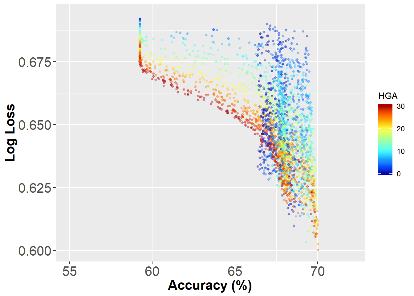
Thats a quite interesting pattern. The best combination of accuracy and LogLoss appears to be around 70% and 0.59 respectively. In this graph I’ve also coloured each dot by the value of the HGA. It seems like there is an Optimal HGA that is around 25 pts.
Taking the bottom right point as our winning combination yields the following optimal configuration of our ELO model:
# Optimal ELO settings
HGA <- 24
carryOver <- 0.12
k_val <- 50
max_marg = 50
initial_value = 1500
Finally, we need to actually compute the ELO ratings for each team and each match using the aforementioned settings. We can do this by simply replicating the for loop with a hyper parameter dataframe with 1 row. Of course a better way to do this would be to functionize the whole things, but aint no body got time fo dat
hyper_parameters = expand.grid(HGA, carryOver, k_val, max_marg, initial_value) %>%
    rename(HGA = Var1, carryOver = Var2, k_val = Var3, max_marg = Var4, initial_value = Var5)

Ntests <- 1

hyper_parameters <- hyper_parameters[sample(1:nrow(hyper_parameters), Ntests),
    ]

optimization_result <- hyper_parameters
optimization_result$acc = 0
optimization_result$LL = 0
acc_best = 0
# Train the ELO
for (i in 1:nrow(hyper_parameters)) {


    map_margin_to_outcome <- function(margin, marg.max = max_marg, marg.min = -max_marg) {
        norm <- (margin - marg.min)/(marg.max - marg.min)
        norm %>% pmin(1) %>% pmax(0)
    }

    elo.data <- elo.run(map_margin_to_outcome(Home.Points - Away.Points, hyper_parameters$max_marg[i],
        -hyper_parameters$max_marg[i]) ~ adjust(Home.Team, hyper_parameters$HGA[i]) +
        Away.Team + group(seas_rnd) + regress(First.Game, hyper_parameters$initial_value[i],
        hyper_parameters$carryOver[i]), k = hyper_parameters$k_val[i], data = results)

    # Calcualte the results
    elo_Results <- as.data.frame(elo.data)

    elo_Results <- elo_Results %>% mutate(pred = elo_Results$p.A > 0.5, obs = elo_Results$wins.A >
        0.5)

    # Metric 1: Overall Accuracy
    optimization_result$acc[i] = mean(elo_Results$pred == elo_Results$obs)

    # Metric 2: Log Loss
    optimization_result$LL[i] = LogLoss(elo_Results$p.A, elo_Results$obs)


}
Step 2: Creating the animation
Now that we have our optimal model, its time to build the AFL ELO ratings bar-chart race.
Get the ELO data over time
First we need to extract the data out of the model and do some wrangling
# Get data out of the elomodel
elo_time <- as.data.frame(as.matrix(elo.data))

# Add on a Game ID as an increaseing integer
elo_time <- cbind(1:nrow(elo_time), unique(results %>% select(Season, Round.Number)),
    elo_time) %>% rename(GameNumber = `1:nrow(elo_time)`)

# Sample the data frame
elo_time %>% head()
## GameNumber Season Round.Number Adelaide Brisbane Lions Carlton
## 1 1 1897 1 1500 1500 1489.931
## 2 2 1897 2 1500 1500 1490.853
## 3 3 1897 3 1500 1500 1474.611
## 4 4 1897 4 1500 1500 1465.257
## 5 5 1897 5 1500 1500 1447.380
## 6 6 1897 6 1500 1500 1453.260
## Collingwood Essendon Fitzroy Footscray Fremantle Geelong Gold Coast
## 1 1508.345 1511.637 1510.069 1500 1500 1488.363 1500
## 2 1519.275 1498.309 1529.422 1500 1500 1470.354 1500
## 3 1516.104 1514.552 1522.125 1500 1500 1473.526 1500
## 4 1513.620 1527.818 1508.859 1500 1500 1482.879 1500
## 5 1519.555 1541.973 1502.924 1500 1500 1507.512 1500
## 6 1520.705 1541.539 1496.976 1500 1500 1513.460 1500
## GWS Hawthorn Melbourne North Melbourne Port Adelaide Richmond St Kilda
## 1 1500 1500 1510.224 1500 1500 1500 1491.655
## 2 1500 1500 1528.402 1500 1500 1500 1472.096
## 3 1500 1500 1535.699 1500 1500 1500 1450.188
## 4 1500 1500 1543.070 1500 1500 1500 1442.817
## 5 1500 1500 1560.947 1500 1500 1500 1428.662
## 6 1500 1500 1559.796 1500 1500 1500 1422.782
## Sydney University West Coast
## 1 1489.776 1500 1500
## 2 1491.288 1500 1500
## 3 1513.196 1500 1500
## 4 1515.680 1500 1500
## 5 1491.047 1500 1500
## 6 1491.481 1500 1500Now we have a rather large wide dataframe with each row representing a moment in time (game ID) and each column representing the ELO ratings for a particular team. We need to get this into long format using the “gather” function from the tidyr package. We also need to manually trim some of the teams since they don’t actually exist in certain time periods (e.g., Adelaide pre-1991 and Fitzroy Post 1996). We will only be looking at seasons beyond 1989 but you could easily adjust the code to visualise earlier seasons. Afterwards, we do some more wrangling. This involves calculating the 10 game exponential moving average of the ELO ratings and creating a new rank column to rank each team based on descending exponential ELO ratings.
The reason why we are using the exponentially weighted moving average rating is so that we smooth out any high frequency variations in ELO. This makes sense as we want to understand the long term behavior of teams’ success. Its also good visually since it will prevent the placings from swapping every round, making it difficult to follow.
elo_time_long <- elo_time %>%
  tidyr::gather(Team, ELO, Adelaide:`West Coast`)%>%  # Gather - wide to long
  arrange(GameNumber) %>%
  filter(Season >=1989) %>%  # Filter >=1989
  filter( !(Season <1996 & Team == "Fremantle") ) %>% # get rid of certain teams from certain seasons.
  filter( !(Season <1997 & Team == "Port Adelaide") ) %>%
  filter( !(Season <=2011 & Team == "GWS") ) %>%
  filter( !(Season <=2010 & Team == "Gold Coast") ) %>%
  filter( !(Season >1996 & Team == "Fitzroy") ) %>%
  filter( !(Season <1991 & Team == "Adelaide") ) %>%
  filter( !(Team == "University") ) %>% # Sorry University
  group_by(Team) %>%
  mutate(exp_ELO = movavg(ELO,10,"e")) %>% # 10game exponentially weighted moving average
  ungroup() %>%
  group_by(GameNumber) %>% # Create the Rank
  arrange(desc(exp_ELO)) %>%
  mutate(rank = 1:n()) %>%
  ungroup() %>%
  arrange(GameNumber) %>%
  mutate(exp_ELO = exp_ELO-1400) %>% # Rescale the Elo for viewing purposes
  filter(rank<=8) # Filter out ranks greater than 8

# Change the name os Sydney to Swans since they were previously South Melbourne
elo_time_long$Team[elo_time_long$Team=="Sydney"]="Swans"

elo_time_long %>% head()
## # A tibble: 6 x 7
## GameNumber Season Round.Number Team ELO exp_ELO rank
## <int> <dbl> <int> <chr> <dbl> <dbl> <int>
## 1 1987 1989 1 Hawthorn 1587. 187. 1
## 2 1987 1989 1 Footscray 1524. 124. 2
## 3 1987 1989 1 Essendon 1520. 120. 3
## 4 1987 1989 1 Collingwood 1515. 115. 4
## 5 1987 1989 1 Swans 1513. 113. 5
## 6 1987 1989 1 Geelong 1510. 110. 6Creating the animation
Now the part you have all been waiting for…the code to create the animation! At a high level, we are going to create a normal ggplot out of a geom_tile, annotate it and then use gganimate’s API to bring it to life.
First, we would like to have each of our bars be the colors of the teams they represent. This means we need the colours of each time. I had to code this in manually but its quite easily - just a simple table with team names and the first, second and third colors of each team.
colors = read.csv(paste0(cDir, "/afl_team_colors.csv"), stringsAsFactors = F)

colors %>% head()
## Team p_color s_color t_color
## 1 Adelaide blue red gold
## 2 Port Adelaide cyan4 black white
## 3 Brisbane Lions navy blue maroon gold
## 4 Carlton white navy blue white
## 5 Collingwood black white black
## 6 Essendon black red blackOnce the colors are loaded, we can left join them to our data set.
elo_time_long <- elo_time_long %>% left_join(colors, by = "Team")Finally, before we can start creating the graph, we need some label elements (Season and Round). The graph time dimension will be incremented based on the GameNumber (defined right at the beginning). So to label it properly, we need some label vectors that output the Season and Round with a time stamp input. This is simply a vector of the Season and Round.
year_label = (elo_time$Season)
round_label = (elo_time$Round.Number)
Creating the graph will be a regular ggplot sequence, first creating a geom_tile to represent the bars, labeling the bars, coloring the text and bars with the appropriate colors, and adding a theme. Note the use of scale_color_identity() and scale_fill_identity() to tell ggplot to take in the content of the color columns as the color rather than apply its own color map.
The gganimiate API starts with transition_time and uses GameNumber to increment the time. Dynamic labels are created in the labs function using curly braces.
windowsFonts(Times=windowsFont("TT Times New Roman"))

 p<- ggplot(elo_time_long[1:(26*8),], aes(x = -rank,y = exp_ELO, group = Team)) + # Only doing a subset of the data for illustrations
  geom_tile(aes(y = (exp_ELO) / 2, height = exp_ELO,color= p_color,fill = s_color),size = 1, width = 0.5,alpha = 0.9)+
  geom_text(aes(label = Team,colour = t_color ), hjust = "right", fontface = "bold",nudge_y = - 10) +
  scale_color_identity()+
  scale_fill_identity()+
  geom_text(aes(label = scales::comma(exp_ELO+1400)), hjust = "left", nudge_y =10, colour = "grey30")+
  scale_x_discrete("") +
  scale_y_continuous(breaks = c(0,150,300), labels = c(0,150,300) + 1400,limits=c(0,350))+
  ylab("ELO")+
  coord_flip(clip="off")+
  hrbrthemes::theme_ipsum(plot_title_size = 32, subtitle_size = 24, caption_size = 10, base_size = 20) +
  theme(panel.grid.major.y=element_blank(),
        panel.grid.minor.x=element_blank(),
        legend.position = "None",
        plot.margin = margin(2,2,2,2,"cm"),
        axis.text.y=element_blank() )+
  transition_time((GameNumber) )+# gganimiate API starts here
  ease_aes('linear') +
  labs(title = "AFL Top 8 ELO ratings 1989-2019", subtitle = "Season: {year_label[round(frame_time,0)]}, Round: {round_label[round(frame_time,0)]}")
Once we have the animation defined, its time to animate using the animate function. The function takes in several parameters that control how the gif looks in the end. nFrames controls the number of frames, fps controls the speed and width and height control the size. More frames with create a smooth transition animation at the expense of filesize. Finally, anim_save can be used to save the animation.
animate(p, nframes = 300, fps = 26, end_pause = 10, width = 600, height = 700)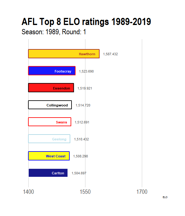
anim_save(filename = "animation_example.gif")Conclusion
That’s it! I hope you found this tutorial useful. Like I mentioned, there are many ways to optimise the code further, so I’ll leave that as an exercise.